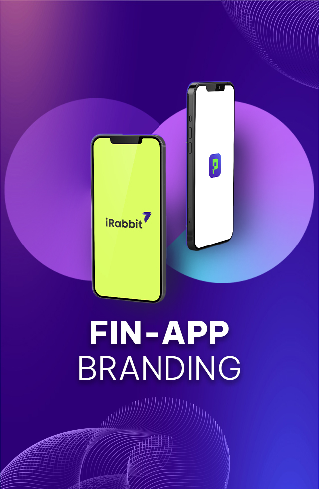
Fin-App is a financial investment app that aims to make investment opportunities available to all Vietnamese in a simple and accessible way.
To prepare for the launch of Fin-App, Aurora faced a challenge of developing its brand story & brand identity, with different requirements:
Be unique to stand out in Vietnam’s competitive market for financial investment apps.
Be amazing and simple to represent the product’s positioning – “simple for everyone“, when most Vietnamese still find the financial complicated and confusing.
Client:Fin - app
Industry:Finance
Time:2021
Our Approach
Aurora has proposed three approaches for Fin-App, including:
Focus on Gen Z – An untapped consumers group with promising prospects.
Build a dynamic, engaging brand image while retain distinct brand personalities and values.
Develop trendy, modern and minimal designs.
Based on these strategies, Aurora developed two concepts for Fin-App:
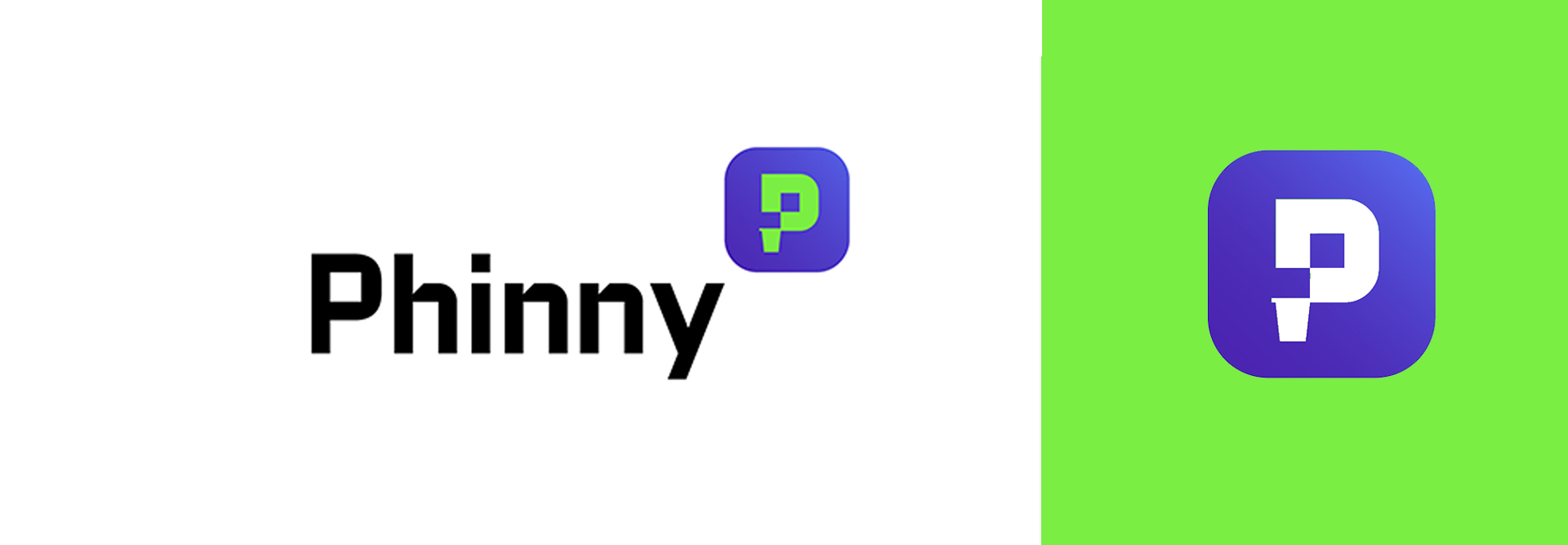
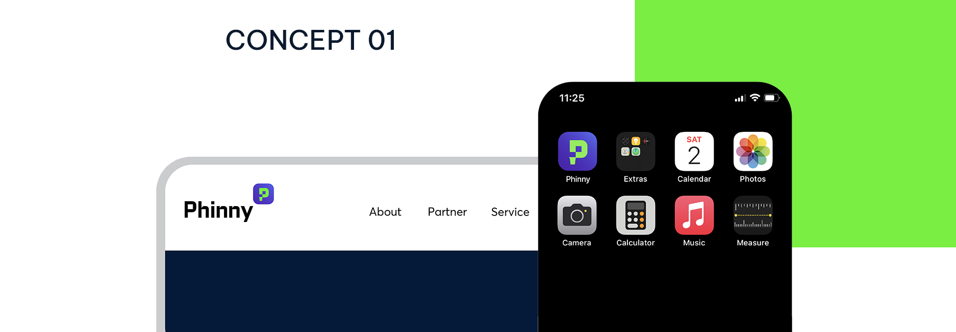
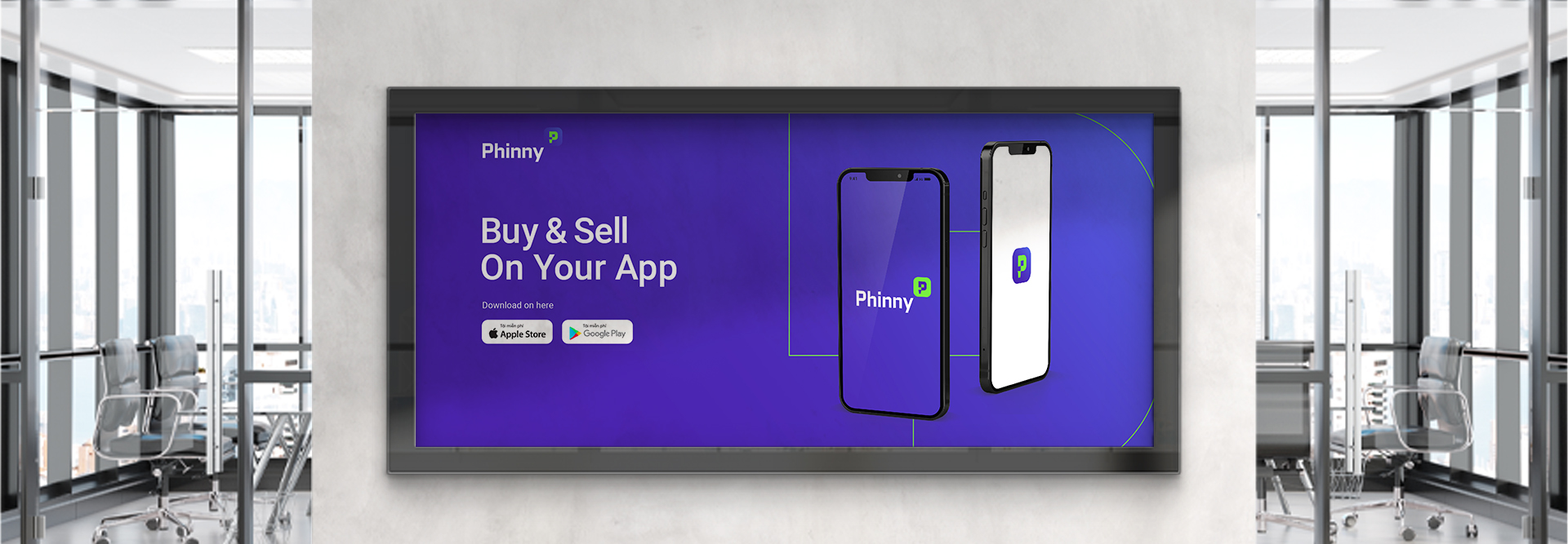
CONCEPT 01: PHINNY
Phinny was inspired by two homonyms ‘Phin’ and ‘Fin’. ‘The word ‘Phin’ was derived from the traditional Vietnamese way of drinking coffee – ‘Phin’ coffee. Meanwhile, the word ‘Fin’ was based on Fintech – the new wave of technology that has changed global finance, allowing mass audiences to quickly understand and start investing. Moreover, the added suffix ‘y’ was inspired by ‘Money’ and ‘Funny’, making the name ‘Phinny’ more intimate, interesting and youthful.
Story orientation: Phinny recalled the image of Vietnamese people drinking ‘Phin’ coffee while discussing investment, in which Phinny was a partner helping users successfully achieve financial investment goals.
Identity orientation: The logo was a creative combination of the letter ‘P’ in ‘Phinny’ and the modern image of a ‘Phin’ coffee cup, which made the customers feel familiar and resonated with the brand’s story.
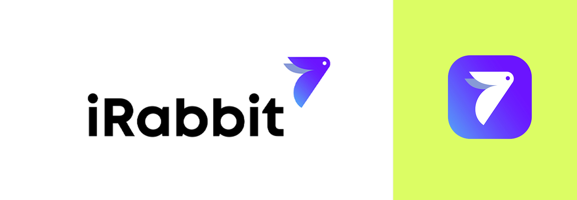
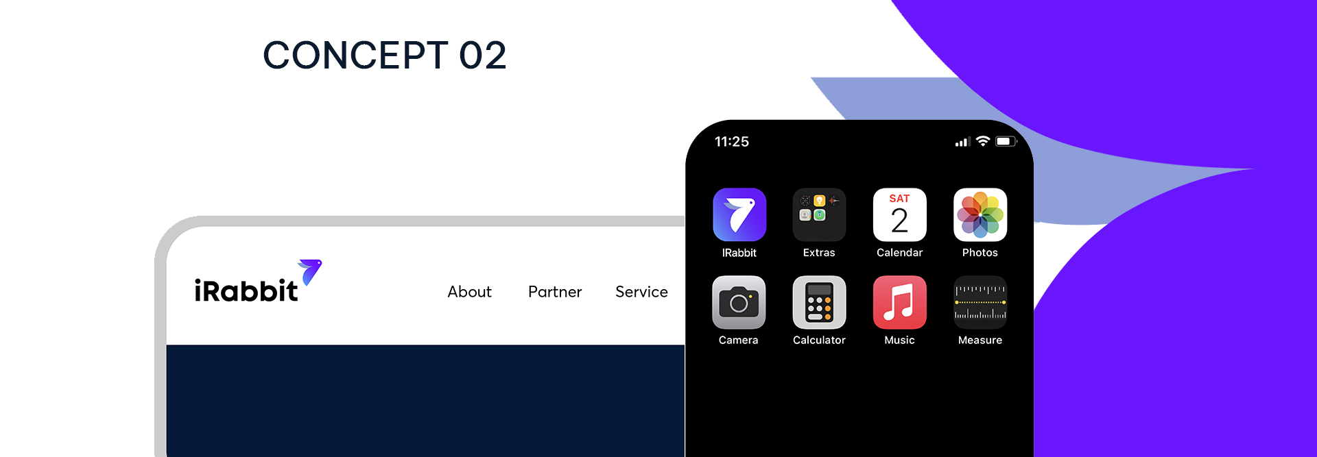
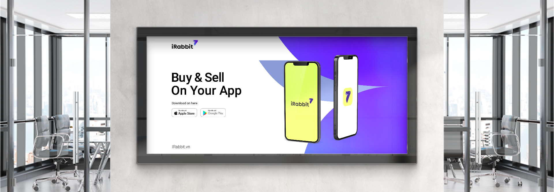
CONCEPT 02: IRABBIT
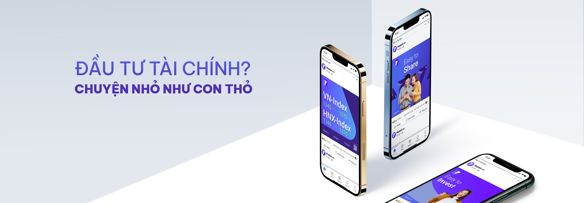
Complex and difficult to learn and only for the wealthy, experienced people are two common misconceptions regarding the financial investment. Based on a Vietnamese proverb “Chuyện nhỏ như con Thỏ”, iRabbit was created to accomplish the mission of simplifying complicated financial investment in Vietnam.
Story orientation: iRabbit simplified all stereotype about financial investment by allowing users to start investing with a small amount of money. A storytelling approach was casual and friendly to attract the target customers, especially Gen Z.
Identity orientation: The logo design was based on an image of a rabbit with an upward diagonal direction like an arrow to represent the fast growth result, which customers can achieve when using the app.
Key activities:
Brand Story & Naming
Logo & Brand Identity
And for many brainstorming sessions and sleepless nights to create the success of this project, thank you our beloved Light Chasers, partners and friends.